User centred design
Introduction
Interaction
User Models & Mapping
User Perception
Aiding the User
Usability Assessment & Method of Evaluation
Interface Development
Conclusion
Introduction 
Shneiderman [1992] suggests that
the concept of a "participatory design strategy" where
the user of a system is involved, iteratively, in its design and
evaluation is a controversial one. It seems obvious that involving
the user of a potential system in its development can only bring
advantages. As noted by Baroudi cited in Shneiderman [1992] "user
involvement brings more information about tasks, an opportunity
to argue over design decisions... and the potential for increased
user acceptance of the final system". Indeed Keen cited in
Shneiderman [1992] recognised the problem of "counterimplementation"
(basically a reluctance to welcome and adopt a system) and suggests
that early participation of users will enable their concerns to
be heard and resolved.
Basically the user should know what
is wanted from the system so why should the designer try to second
guess what he wants if he can just ask him in the first place?
Norman [1988] considers user centred
design to be "a philosophy based on the needs and interests
of the user, with an emphasis on making products usable and understandable".
In this chapter I will detail the theory and practical implementation
of this user centred design philosophy, giving examples where
necessary to illustrate and aid my arguments.
Interaction

Introduction
Interaction between the user and
a system can be deemed to be the communication required to complete
tasks. Grandjean [1988] suggests that these "points of interchange
from man to machine and from machine to man -interfaces-
are of paramount importance". I will, in this section, describe
why the interface has such an important role to play in interaction
and will also discuss various models of interaction that endeavour
to aid the designer of interactive systems.
The Interface
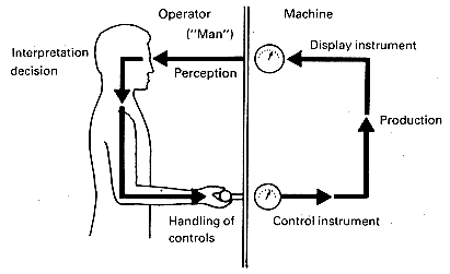
Consider figure
K in which Grandjean [1988] shows a simple "Man-machine
system". He explains that the cycle involves the user reacting
to the display control by operating the control of the machine
to effect the required change. The control instrument informs
the user of the result of his action "e.g. how much water
has been mixed in with reagents" and the display instrument
relays whether this action has been effective. In turn this information
will aid the user in deciding whether further action is needed.
Figure K
Grandjean [1988] proposes that in
the system "the man holds the key position because the decisions
rest with him". It can therefore be demonstrated that the
decisions he makes rests on the accuracy of the feedback he receives,
and his "perception [and] interpretation" of it, from
the interface (in this case the control and display instrument).
Display Instruments
Therefore display instruments are
not just the end result of an action but the impetus for a new
one to be made. The accuracy of the perceived and interpreted
information is paramount and there has been much research into
the effectiveness of display instrumentation to achieve this.
Depending on the context of its role, a display instrument may
prove suitable for one task but not for another.
Grandjean [1988] considers this
in terms of two types of displays; firstly a digital counter and
secondly a moving pointer against a fixed scale. The counter display
is "very good" in terms of its "ease of reading"
but "poor" in the "detection of change". Alternatively
the pointer display is "acceptable" in terms of its
"ease of reading" but very good in the "detection
of change".
Thus there is need to consider appropriate
display instrumentation when designing systems. The designer will
need to take into account which is the most significant requirement
of a system's design before choosing which type of display to
employ.
Gulfs
of Execution & Evaluation
When a user comes up against an
interface, he may know what he ultimately wants from the system,
such as moving a car, but he may "not know which physical
variables to adjust, or in what way to adjust them" [Norman
cited in Booth 1992], i.e. he may not know how to drive. When
I started to learn to drive I just assumed actually moving a car
was just an extension of natural movement (which it is once you
can drive!), every other driver seemed to be able to move the
car automatically without thinking.
Hutchins et al cited in Preece
et al [1994] developed a framework which describes a "distance
between the user's goals and the means of achieving them through
the system". This gap is termed the "gulf of execution"
[Norman 1988 and Hutchins et al cited in Preece et al
1994]. Dix et al [1993] recommend that "the interface
should therefore aim to reduce this gulf".
Preece et al [1994] suggest
that this should be done by "designing the input characteristics
to match the users' psychological capabilities", effectively
mapped in other words (mapping is considered in User Models & Mapping) improving guessability.
Similarly the user needs to be able
to "interpret the physical state of the system and to determine
how well [their] expectations and intentions have been met"
[Norman 1988]. The amount of effort required to do this reflects
the "gulf of evaluation" according to Norman [1988].
Preece et al [1994] suggest
that by "changing the output characteristics of the system"
this gulf can be reduced. This change may take the form of more
effective or appropriate displays (or perhaps the introduction
of them) or quicker feedback generally. The windows hour glass
timer, for instance, sometimes indicates that the system is currently
processing when it may have actually crashed.
The greater the size of the gulfs
the harder it will be for the user to carry out the task. The
onus should be on the designer, rather than the user to "bridge"
both gulfs to achieve the smallest possible distances between
the physical system and the goal.
General Framework for Interaction
Dix et al [1993] suggest
that Norman's [1988] model "concentrates wholly on the user's
view of the system ... and ... does not attempt to deal with the
systems communication through the interface". As a result
Abowd and Beale [1991] expand on this model in order to provide
a "general interaction framework which will allow analysis".
I only cite their paper in order to reinforce my views on the
way in which users see the interface and to highlight the similarity
between both models.
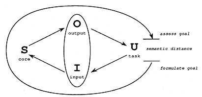
Abowd and Beale's [1991] unifying
framework for interaction is shown at figure
L where the oval in the centre of the diagram represents the
interface, S represents the system and U the user. The "systems
language" is referred to as "core" whilst the "user's
language" is referred to as the "task". Despite
the model having 4 "translation steps", to explicitly
involve the system's own communication, it can be seen that progress
from U to I to S still reflects the gulf of execution and completion
of the interaction cycle from S to O to U can be considered to
represent the gulf of evaluation.
Between each node on the model,
the "translation steps" are "qualitative assessments"
on the quality of translation between the languages. Abowd and
Beale [1991] refer to them as distances. "The most important
measure" of distance in the framework is the difference between
the "semantics of intention (goal formulation)" and
the "semantics of evaluation (goal assessment)" and
this is referred to as the semantic distance. The distance is
an assessment as to how effective the user can establish if his
actions (the undertaking of the task) has achieved the desired
result (the goal).
Figure L
It can therefore be seen that effective
interface design will demonstrate the reduction of this semantic
distance so that it is "as small as possible" [Abowd
and Beale 1991]. This is in direct agreement with the notion that
"bridging the two gulfs [of execution and evaluation]",
as recommended by Preece et al [1994], is paramount to
overcome the "mismatch between the user's way of thinking
about their tasks and the system's representation [of them]".
Conclusion
In this section I have detailed
what interaction is and how interaction models have given an understanding
to the cognitive processes that take place at the interface. The
models have stressed the importance of perception (User Perception) and feedback (Feedback) and how the quality of these elements can ultimately affect
the overall usability of an interactive system. This discussion
has identified the notion of mapping and it is this that I now
turn my attention to.
User
Models & Mapping
Introduction
In this section I will initially
discus an area of user centred design that will focus on the user
himself in the form of a user model (not to be confused with the
cognitive model that a user has of a particular system). I will
analyse why the understanding of the user group is a vital ingredient
in the usability recipe. Secondly I will examine the theory of
mapping in which many designs exploit generic human methods of
movement and cultural understanding that can make a system or
device more natural to learn and to use.
Know
Your Audience
Nobody would consider designing
a car that needed three arms to operate it because it would be
obviously absurd, after all we are all human and only have two
arms (baring accident of course). Modelling or profiling may at
first glance seem irrelevant for most systems but consider the
following example of a simple task.
Whilst on holiday in Spain recently
I attempted to make a telephone call back to the UK from a public
phone. The instructions displayed in the phone stand were multi-lingual
so I assumed there would be no problem; firstly because it was
an international call, I was instructed to dial 07 and wait for
the higher tone; then I had to dial the country code which I could
select from a list of about 30 countries. It was at this stage
that I became stuck since the countries were listed in Spanish
(which I don't understand). I couldn't even make a guess since
the country I needed was Reino Unido (United Kingdom), code -
44.
Despite the best intentions of the
display design to take into account the possibility that not all
phone users will understand Spanish, it had not gone far enough
to make the system robust for ALL potential users (probably because
the system was not tested using single language users).
Some users may have very specific
profiles that require specialist designs. For instance blind people
are a specific user group whose needs must be considered at the
design stages to ensure that a system or product will be suitable.
A main stream Connect 4 board game using red and yellow counters
will be totally useless for blind players because they will not
be able to identify the colour of the counters. The design of
the game counters for this particular user group must therefore
be changed to take into account the peculiar disability. This
has been done by drilling a hole in one set of counters enabling
them to be distinguishable from the other [RNIB 1996].
Therefore it can be seen that there
is an element of 'know your audience' when designing systems to
ensure that they are suitable for the whole user group.
Light
Switches
After living in the same house since
I was born, I reckoned I knew which light switch was which:
My house is two storey and I have
the ability to switch the upstairs landing light on or off from
the downstairs hallway or from the landing itself . The switch
on the landing is a single switch but the switch in the hallway
also encompasses the switch for the hallway too. The double switch
panel was made of Bakelite and the switch for upstairs was situated,
on the panel, above the one for downstairs. The house was re-wired
five years ago and this old Bakelite double switch was replaced
with a more modern one. The switches for both the upstairs and
downstairs lights are located horizontally aside each other. It
looks nicer than the old panel but, despite the time span, I still
haven't a clue which one switches which light.
The moral here is to use "natural
mapping", as discussed by Norman [1988], to fit the real
world task onto the control for that task. In this way there is
no need to make a conscious decision, which may indeed by the
wrong one. The top switch for the top light seems to be an obvious
solution rather than the right (I think it's right) switch being
for the top light.
Putting this concept into an IT
context Cuomo & Bowen [1994] suggest that "effective
USI design is to minimise human information processing or cognitive
demands on the computer system user". If there is a possibility
to map tasks onto controls using "physical analogies and
cultural standards" [Norman 1988] I suggest they should be
used because they reduce the need for the user to make a conscious
choice. I will now discuss the former of these mapping techniques
in considering another situation where the real world doesn't
seem to fit or naturally map its controls. The latter is discussed
in The Sign and the Use of Colour
and Constraints.
Bath Time!
Consider the situation in which
a person takes a bath. Abowd and Beale [1991] consider this scenario
in terms of their "Unifying Framework for Interaction",
which I have discussed in General Framework for Interaction .
What seems to be a natural way of performing the task, i.e. filling
the bath with water from two taps, is quite poorly mapped because
the semantic distance (in which the bather has to determine whether
the intended goal has been accomplished) is quite large. Let me
explain further:
The task concerned, involves two
goals. Firstly the bather needs to fill the bath with water. Secondly
he needs to obtain the correct temperature for the water. If one
of the taps controlled the amount of water and the other set the
temperature, all the bather would need to do is initially set
how much water he needed and what temperature he wanted. The output
would therefore be clear cut and the semantic distance shortened
as a result.
However in common reality both taps
contribute to, both, the water flow and the setting of the temperature.
The semantic distance increases because the bather has to constantly
check the water and temperature levels (the output) and make iterative
adjustments to the input (i.e. both taps) to accomplish this,
quite complex, task. If the taps did control the temperature and
water flow independently then this "complexity is squarely
placed on the system side" [Abowd and Beale 1991] as opposed
to the bather as it is in common reality.
Abowd and Beale [1991] consider
that a large semantic distance in the example of filling a bath
is "precisely what should be avoided in a good interactive
system". Ironically however this design is still used despite
the fact that it is quite poor from the view of natural mapping.
I would consider the reason for this is two fold. Firstly to produce
a system of independent temperature and water flow is complex
(since water is usually delivered by two pipes, one hot and one
cold [Abowd and Beale 1991]) and/or relatively costly (a domestic
shower unit is an example of such a system). Secondly, since a
significant amount of the world's population have taken a bath
each week since they were born using hot and cold taps, the extra
effort they are putting in to undertake the task is a seemingly
natural process in its own right anyway and thus distracts them
from realising their extra effort.
Handles/Levers
The previous two examples have demonstrated
systems with poor mapping causing one to be inconvenient and the
other, due to the reasons given, to be unaffected. Not all interactive
systems however have this tolerance against inappropriate or unmatched
mapping. In safety critical systems, where lives depend on effective
interaction at the interface, it is even more important that "controls
and displays exploit natural mappings" [Norman 1988]. This
view is endorsed by Grandjean [1988] who proposes that "any
controls that might be mistaken for each other should be so designed
that they can be identified without difficulty".
Consider McFarland cited in Grandjean
[1988] who reports that "the American airforce in World War
II suffered 400 crashes in 22 months because the pilots mistook
some other lever for that controlling the under carriage".
In situations where split second decisions are needed effective
interface design cannot be undervalued. Bates [1996] proposes
that the "safe and successful implementation of new systems
will depend on their design and operation". I have uncovered,
that after a disaster it had usually been the poor user who gets
the blame rather than the design (surely all 400 pilots can't
be wrong).
There are many instances of where
user 'error' has been cited as the initial cause but further investigation
has resulted in a more critical look at the systems themselves.
Johnson [1994] refers to the "Kegworth and the Three Mile
Island disasters" in which "substitution errors"
were a "contributory" factor. In the case of Kegworth
the investigation concluded that "the on-board systems failed
to prevent pilots from shutting down a healthy engine" [Air
Accidents Investigation Branch cited in Johnson 1994]. It seems
that as research continues into analysing accident investigation
methods, the initial presumption to blame the user is now tempered
with a more objective review over the whole interactive system.
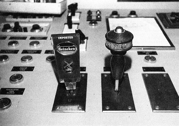
Returning to Grandjean's [1988]
suggestion of controls consider figure M
by Joseph L. Seminara cited in Norman [1988]. These knobs can
be found in a nuclear plant and they have both been customised
to enhance identification. Ultimately this helps to avoid the
possibility of the operator pulling the wrong switch in two ways.
Visibly the look different but they also feel different too. They
may not look good but both controls have become more difficult
to substitute, in error, for each other.
Figure M
Conclusion
In this section I have considered
the reasons for undertaking a profiling of the target user group
and explained why good design benefits from it. User modelling
is a large area of research in its own right and I discuss it
further in Customer Requirements . I have also described the advantages of mapping, which
has the ability to help reduce the interaction distances (or gulfs)
and have illustrated my arguments by discussing examples of good
and bad designs.
User
Perception
Introduction
Interface design requires a knowledge
of how users will perceive the information given to them at the
interface whether it is a VDU screen, cash point or switch panel
etc. I will demonstrate, in this section, that people perceive
or 'see' their own version of the world and why recognition of
this must be appreciated in order to effect usable designs.
It has been argued that there is
two main categories of theoretical approach to human perception.
Constructivist theorists such as Gregory cited in Preece et
al [1994] believe that "the process of seeing is an active
one in which our view of the world is constructed both from information
in the environment and from previously stored knowledge".
Alternatively the ecological approach as outlined by Gibson cited
in Preece et al [1994] interprets perception to be "the
process of picking up information from the environment
and does not require any processes of construction or elaboration".
Constructivist
Theory
There is much evidence to support
the view of constructivist theory. Consider the pattern of dots
in figure N.
Upon viewing the photograph taken
by RC James, (in [Preece et al 1994]), some viewers may
not be able to perceive a recognisable pattern in the dots. However,
even if prompting is required to establish the scene of a sniffing
Dalmatian, a constructivist theorist would argue that "without
the prior knowledge... of what a dalmatian looks like... we would
not be able to make sense of the picture" [Preece et al
1994]. In effect the viewer is constructing a model of what is
expected and from the clues given.
Figure N
Consider the following list:
1 2 3 4 S 6 7 8 9 10 l1 12
A viewer of this list may see an
S instead of a 5 but would he notice the l1 (the letter l and
the number one) instead of the expected 11? Again, in this example,
expectation may overrule what is actually seen by the eye.
In the next example shown at figure
O there is no doubt that the image shows a drawing of a woman.
However how old is the woman? It depends on the viewer; some may
perceive an old woman whilst others will see a young woman. If
this drawing has been witnessed before the viewer will see both
again highlighting that experience is drawn on. Also some viewers
may have subconsciously chosen to remember only one, until prompted.
Figure O
Unfortunately such an unstable picture
can give rise to the viewer being confronted with an oscillating
set of images with which he is unable to concentrate on only one
of them. Pratchett [1996] in his fantasy Discworld novel describes
a magic carpet which "had a complex pattern of golden dragons
on a blue background" which after lengthy staring seemed
to become "blue dragons on gold background" and "that
if you kept on trying to see both types of dragon at once your
brains would trickle out of your ears". I'm not suggesting
such an image would result in the same effects in the real world
but the potential for similar stress and inaccurate display can
be demonstrated.
Preece et al [1994] further
contribute to the constructivist theory by suggesting that we
build on what we see by using our "prior knowledge and expectations".
Otherwise, as Gregory cited in Preece et al [1994] points
out, considering that since "we are [just] given tiny distorted
up-side-down images in the eyes ...[with which we have to model
the world.]... this ...[would be]... nothing short of a miracle".
It is not surprising that each of
us will have our own limited view of the world.
Ecological
Theory
Alternatively ecologists believe
that "perception is a direct process in which information
is simply detected" [Gibson cited in Preece et al
1994].
Returning to the example of the
door knob/push plate in the introduction to Guessability it was argued that the guessability
of the system was based on previous knowledge, similar in theory
to the constructivist approach. Conversely Gaver cited in Preece
et al [1994], however, sites a similar example of a door
opening system to justify ecological theory, the argument being
based on the notion of affordances. Preece et al [1994]
expounds this in terms of Gaver's example: A "thin vertical
door handle affords grasping , which in turn affords pulling...
[where as a] ..flat horizontal plate affords a pushing action
rather than a grasping action" implying that both views carry
some weight of evidence.
Conclusion
Perception therefore is an important
element in the role of understanding how the user meets the interface.
It has been established, as understood by constructivists, that
different viewers will perceive the same data in differing ways
based on their own "mental models" of things. As Norman
cited in Booth [1992] confirms "these internal models...
by which people can... predict the world around them... tend to
be incomplete, unstable, do not have firm boundaries, are unscientific
and parsimonious".
Therefore any scene is not only
perceived on what can be seen but also on what is predicted based
on an individual's own mental picture which can thus be open to
a wide range of interpretation.
Preece et al [1994] however
also summarise that design, considered in terms of ecologist theory,
is also susceptible to a range of interpretation based on the
notion of whether or not the affordances in question are "perceptually
obvious... [or]... ambiguous" resulting in errors at an interface.
I would not argue with this view which seems to be a good foundation
from which to design.
Consequently, I would suggest that
both theories subscribe to the belief that for a usable design
for an interactive device to be achieved, a reduction in the range
of possible errors in perception must be reached, whether the
system is predicted based on the, possibly, erroneous preconceived
ideas of the user or on the ambiguous affordances of the system
itself.
Aiding
the User
Introduction
"Designing well is not easy"
as Norman [1988] points out. I would suggest that the main reason
for this is because users happens to be human. However this may
be turned to advantage when designing interactive systems and
there are ways in which design can be improved without the need
to undertake great research or effort.
Constraints
In contrast to affordances (as outlined
in Ecological Theory ) there are constraining methods by which
a designer is able to limit the user in operating an interactive
system . Norman [1988] aptly summarises this by stating "that
affordances suggest the range of possibilities [whilst] constraints
limit the number of alternatives". According to Norman [1988]
there are four types of constraints.
Firstly there are physical design
constraints in which a user will be constrained from undertaking
an action by the actual physical form of the device. One example
cited by Norman [1988] is the design of the ubiquitous 3½"
floppy disk; despite the eight conceivable ways of putting the
disk into the drive bay only one is possible due to the physical
shape of the disk (try it!).
Norman [1988] also considers "forcing
functions" which he deems to be "strong constraints".
One example he cites to demonstrate these is the NES whose design
doesn't constrain the user as it should. The instruction manual
for the game console cautions the user, in large upper case lettering,
to switch off the game before removing the game pack. The game
program may be corrupted if removed before the power is switched
from it. Norman [1988] considers that this function (of switching
off power before game removal) should be forced and not just warned
about. It is interesting to note that its rival, the Sega Megadrive
also had the same design flaw and that Nintendo had this function
forced on its upgrade console, the SNES.
Secondly there are semantic constraints
which "rely upon the meaning of the situation to control
the set of possible actions" [Norman 1988]. For instance
an anti-glare screen should be placed at the front of a screen
even though it may well fit neatly on the top of a PC.
Thirdly cultural constraints may
be used to increase natural usability. I have already discussed
the use of colour to satisfy expectation making choice easier
(The Sign and the Use of Colour ) but
there are other ways in which cultural norms can reinforce and
constrain users decisions. Consider the following scenario which
gives a good example of where cultural constraints have not had
the desired effect.
The effect of driving on the right
hand side of the road on the continent seems to have bred a culture
in which pedestrians also pass on the right. People in the UK
tend to pass on the left. On a visit to a shopping complex in
Tenerife I came across a double escalator that appeared not to
be working so, being British, I walked down the left hand escalator.
When I stepped out of the escalator I glanced around, for no particular
reason, and to my surprise the stairs had started moving. I thought
no more about it until the next time I used the escalator and
noticed that it had an arrow and a no entry sign marked on the
floor in front of each stairway.
Each escalator would start to move
when a person passed into the stairway because they tripped a
light beam switch across their path. Because I had walked down
the 'up' escalator I had actually tripped the switch when I had
passed out of the stairway.
Even taking into account poor observation
the fact is that the constraint of a simple sign on the floor
denoting the 'up' and 'down' direction for each escalator was
not effective enough, some thing more physical, such as a one
way barrier, could have been employed.
Finally designers are able to use
logical constraints to improve the natural mapping of controls
against their function in the eyes of the user . The example of
the light switches I
cited gives a good explanation of logical constraint. Norman [1988]
gives another illustration of logical constraint in the building
of a simple Lego model without the aid of a guide. Some builders
were left with one piece with only one place for it to go. Completion
of the model by the builder was easy because "logic dictates
that all pieces should be used with no gaps in the final product".
Therefore the last piece was logically constrained.
Errors
According to Lazonder & Van
Der Meir [1994] "in learning to use software, people spend
at least 30% of their time dealing with errors". As a result
they suggest that the consideration and acknowledgement of errors,
during interface design, should be explored rather than avoided.
In terms of improving interfaces, the suggestion is an interesting
one since it ultimately implies that if a design is developed
with the goal being a total elimination of errors, then the interface,
by default, should be highly effective and would prove usable.
Mayhew [1992] agrees with this sentiment up to a point and suggests
that "one goal for a software user interface is to minimise
user's errors... because it will most likely be impossible
to eliminate all errors".
Norman [1988] also points out that
"designers make the mistake of not taking error into account".
Accepting that users will make slips from time to time should
be considered to be a core feature of the design process. This
will have a two fold effect; firstly the designer, being aware
of possible error, can aim to reduce them and secondly it will
encourage suitable error recovery to be incorporated into the
overall design for when the user does make mistakes.
Putting
the Burden of Task onto the System
One way in which a system can be
designed to aid the user is by enforcing the system to take the
burden whether this is thinking, analysing, responsibility, or
other processing that could be transferred to it. Let me explain
using an actual example of how the burden of task, in the form
of responsibility, can be transferred.
My local railway station, at Kirkby,
is at the end of the electrified Merseyrail network and at the
start of the diesel line that connects with Wigan and beyond.
The station has two platforms, end to end, which are separated
by a road bridge. This is not the only way they are separate.
The Merseyrail line is controlled by an up to date, computer controlled,
signalling system whilst the diesel line is controlled by a system
that has not changed since the start of the line in the middle
of the last century [Griffiths 1995]. It could be guessed which
one is the more fool-proof.
The diesel line, from Kirkby is
single-tracked until it reaches Rainford whereupon it splits into
two. Consequently if a train passes Rainford Junction heading
towards Kirkby, it must have sole use of this one track until
it is returns to Rainford, allowing another train access to the
Kirkby line. On initial consideration of the system, it appears
that the task of remembering whether a train has passed the junction,
and the subsequent signalling, was the responsibility of the signal
operator.
Unfortunately people are not very
good at remembering things, even a trainload of passengers can
be forgotten during a moment's lack of attention. Even in the
1850's it was realised that to entrust this task solely to one
man's memory would have been quite catastrophic; consider the
carnage if a simple signalling error is made by the signal operator
at this junction. The solution was a very simple one: a peculiar
ring wrapped in leather, about 800 mm in diameter, is requested
by and given to the driver of the passing train by the signal
operator as the train passes alongside the signal box. Any subsequent
train cannot proceed onto the used line, since the signal operator
will not be able to supply the ring.
It can therefore be demonstrated
that the task, of remembering if the line is busy or not, has
been placed onto a system rather than onto a solitary individual.
The system, in this case, refers to the sharing of the responsibility
(between both the driver and signal operator) which drastically
reduced the chance of an error.
Conclusion
In this section I have detailed
how usability can be increased by simply taking into account the
fact that the user is a human being, and as such, has certain
universal traits and habits that can be relied on; as Norman [1988]
suggests we should indeed "design for error".
Usability
Assessment & Method of Evaluation
Introduction
According to Johnson [1992]
"the aim of human factor
evaluations is to identify inadequacies in design and to provide
the design team with a sufficient understanding of how the design
is inadequate, so that it can be redesigned without the same
inadequacies being present."
I wish to highlight three issues
from Johnson's statement. Firstly there is a need for a method
with which the design inadequacies need to be uncovered. Secondly
there is a communication method required to evaluate the information
gleaned from the first. I suggest that involving a user in both
methods will enable a design team to address the purpose of the
third issue; that of effecting a usable design.
However what is a usable design?
Holcomb & Tharp [1991] remark that "only if the ultimate
users of a product are pleased is a product likely to succeed".
How better to do this than to assess and evaluate the system involving
the users of it. Therefore the testing, evaluation and reassessment
of subsequent versions of design as described by Johnson implies
an iterative methodology that I suggest would benefit from involving
the user.
Indeed Holcomb & Tharp [1991]
suggests that users should be "brought into the development
cycle" because this "provides opportunity for feedback",
which I have already demonstrated to be a principal element to
affect overall usability.
In recent years usability assessment
and evaluation has risen in stature and is now seen as a useful
and important tool to aid design rather than being dismissed,
as it previously had, as insignificant criticism. In this section
I will detail methods used in usability testing and describe the
evaluation techniques used to discover design problems.
Structured Walkthrough
For a quick assessment on a proposed
design one cheap and yet highly effective method that can be employed
is a pen and paper exercise. This method involves presenting an
outline of a system's design on cards, story boards or simply
on paper to the user for consideration. Booth [1992] describes
this kind of walk through as a "concept test" which
has the advantage of quickly identifying "concepts that the
user finds acceptable and those that are likely to cause confusion".
Users have the ability, even at this stage, to offer feedback
on the proposals by manually adding to or amending the designs.
I suggest that the role of this test is comparative to that of
a context diagram in systems analysis, giving both the designer
and user an overview of the envisaged system ensuring they both
start off with a common and relevant baseline.
Cognitive
Walkthrough
Lewis cited in Cuomo & Bowen
[1994] considers an evaluation method by which "a list of
theoretically derived questions about the User-System Interface
(USI)" is put to users about how they undertook selected
tasks. The interviewer will also ask the users what tasks in particular
they found difficult to do. The purpose of the test is to ensure
that there is an "Action-Goal" match within the system
on test.
Dix et al [1993] suggest
that this method does not involve the user and that the "basic
intent" behind such a test is to discover design features
that "violate known cognitive principles". They note
that the test is undertaken by the "designer or an expert
in cognitive psychology" who works through each task in the
design noting how the interface will affect the user and whether
the required task can be completed effectively. Dix et al
[1993] compares this to the way in which the software engineer
will go through the design code line by line which was where the
original idea came from [Yourdon cited in Springett & Grant
1993].
Originally cognitive walkthrough
tests were termed "walk-up-and-use interfaces" because
they had been developed for evaluating Automatic Teller Machines
[Cuomo & Bowen 1994].
Dutt et al [1994] considered
this method to "be an effective method as it identifies task
related problems rather than problems of 'taste'" which seems
to suggest that users shouldn't be involved with this method confirming
Dix's description of the evaluation.
Springett & Grant [1993] also
point out another further advantage in that the output from a
system can be "carefully examined" after each step in
the walkthrough has taken place.
Friendly,
Hostile and Simulated Users
As Booth [1992] reports there is
more than one type of user. Friendly users are users who have
some knowledge about the system who are able to make constructive
comments that will be able to enhance designs that naive users
will not have the foresight or experience to suggest. Although
as Hewitt cited in Booth [1992] points out friendly users may
"miss aspects of the system that often cause difficulties
for naive users" anyhow.
Hostile users as noted by Booth
[1992] may have the advantage over naive and friendly users since
they have "no investment in the system" and will have
no fear trying to crash a system. They will be able to apply criticism
to systems exposing "inconsistencies and flaws" that
may have not been uncovered otherwise.
Hewitt cited in Booth [1992] also
defines the possibility of simulating users in which the "progress
of several naive users is charted" which can be subsequently
retraced by the designers. The advantage here is that the designers
can follow a path through the design that they had not "previously
envisaged" [Hewitt cited in Booth 1992] enabling them to
redesign for error handling etc. that would not have been dealt
with.
Thinking Aloud
This method involves users speaking
their thoughts regarding the system to the designer (or a tester)
as they use it, in an informal atmosphere. The tester is on hand
to prompt the user only, without hindering or giving instruction,
and to "listen for clues as to how the user is dealing with
the system" [Lewis cited in Shneiderman 1992]. The advantage
is that the user explores the system in a work-like pattern rather
than following a particular route though the interface which may
not be representative of a real situation.
Attitude
Measures
Users' views of a new system can
be canvassed by interview or by questionnaire. When interviewing
prospective users "the level of questioning can be varied
to suit the context" and also the line of questioning can
"probe the user more deeply on interesting issues as they
arise" [Dix et al 1993]. Dix et al [1993] point
out that interviewing will give the user a chance to mention problems
that may "not have been anticipated by the designer"
of a system and is particularly useful "in eliciting information
about user preferences, impressions and attitudes".
Despite the usefulness of the interviewing
method which will give a general indication of "whether [or
not] a system is likely to be used and appreciated in the work
environment" it may be "open to bias" [Booth 1992].
This bias may be in the form of un-helpfulness on behalf of the
interviewees fearing the "risk that new technology... [which]
will create highly repetitive tasks which will require little
skill..." [Johansson cited in Grandjean 1988] (Keen cited
in Shneiderman [1992] terms this as "counterimplementation").
Alternatively the interviewee may, fearing for his job security,
not wish to appear hostile and so not flag up any negative attributes
about the proposed system which again results in unconstructive
feedback.
Alternatively questionnaires are
usually anonymous and thus have the advantage of being able to
extract a more honest and open response. Unfortunately due to
anonymity the evaluation is only one way and, unless the questions
are open, may only assess pre-defined areas that may not suffer
from usability problems anyway. Questionnaires may use a scalar
(e.g. the Likert or semantic differential scales as noted by Preece
et al [1994]), multiple choice or ranked method of answering.
In the following section I will discuss the attributes of a sample
questionnaire (the SUMI) which uses a Likert scalar method.
SUMI
The SUMI questionnaire (shown at
Appendix 1) was developed by the Human
Factors Research Group, University College, Cork, Ireland as part
of the European MUSiC project [NPL 1996] to measure, subjectively,
the level of satisfaction a user has with software releases. It
has "been developed, validated and standardised across Europe"
and is available in many languages [NPL 1995a] and is often used
as the definitive industry standard (Reuters, for example, use
this questionnaire extensively during usability testing. See Chapter
7). The questionnaire is often used as a baseline by which
subsequent product versions can be measured [NPL 1995a]
The SUMI contains a list of fifty
questions [NPL 1996] that the user can either agree or disagree
with or note an undecided result. It has the ability to give information
in terms of software "efficiency, affect (or likeability),
helpfulness, control and learnability, plus a global measure of
usability" [NPL 1996]. In turn, this allows for the discovery
of "overall strengths and weaknesses" [NPL 1996] of
the software allowing the designers to confirm good design practices
and concentrate on problem areas respectively.
Perhaps one reason why this questionnaire
has been so successful in the field is that it is only part of
the overall family of support for measuring usability assessment
available through NPL. For instance there is software support
for the SUMI, 'sumisco', allowing "computerised administration",
"scoring... [allowing] analysis using a database of standardised
samples" and report generation [NPL 1996] .
The SUMI may be suitable for empirical
analysis but its scalar answering restricts possible responses
that could be obtained if open questions were employed. However
as noted by Dix et al [1993] "probing" questioning
will take more time and resources and, as with most usability
issues, a trade off has to be made.
I feel that the effectiveness of
SUMI, in terms of its own usability, is high because it meets
only the role set for it and does this well. The main advantage
in using this testing method is that it can quickly cover a wide
range of users and that the form itself is easily completed, relatively
cheap and effective as a collector of measurable data. As such
I suggest the SUMI to be an ideal and inexpensive tool that can
be used as an initial 'gut reaction' survey of users when testing
software.
Expert
review
Booth [1992] considers the requirement
for an independent "designer" or a "human factors
expert" in the review of systems. He suggests that the advantage
for such review is that "comments and criticisms are made
from a position of knowledge". However as IT systems continue
their onslaught into all areas of business, manufacturing, leisure
etc., so there is also a need for a greater understanding of the
context and language of these areas. Shneiderman [1992] also recognised
this need and envisaged a professional growth in domain expertise
incorporating areas such as "geographic information, medical
laboratory instruments, or legal systems". Experts are therefore
not just experts in interface design but come from a wide range
of professions.
Bastien & Scapin [1995] however
note that "experts rely on their experience in order to make
a judgement on the ergonomics of a system". Their findings
indicate there is a plethora of inharmonious usability standards
due to this wide range of independent expertise. As a result
they suggest that: "the evaluation of user interfaces is
difficult and that much work is needed if dimensions are to serve
as a basis for an evaluation method". By dimension they mean
real, definable and specific areas or fields of measurement.
They propose, in their paper, that
the dimensions, as well as being defined "explicitly, unambiguously
and consistently" should be able to demonstrate their "utility
and usability". Therefore they propose that any dimensions
of ergonomic criteria should be
· "Valid" restricting
the reviewer to evaluate only those elements that were intended
to be evaluated, but also conversely
· "Thorough" enabling
the widest scope to be achieved in evaluating the particular
interface, and
· "Reliable" producing
the same results under the same conditions.
Molich & Newbon cited in Bastien
& Scapin [1995] suggest that if these conditions were not
met for ergonomic criteria "variability" would result
and "tests would become reliant on expertise only" which
would not provide comparability of result. In addition to the
variability of results, the expert review may not actually detect
"difficulties that hinder a naive user" [Booth 1992]
which is the initial purpose of the review.
Conclusion
In this section I have reported
the various methods used in usability testing and evaluation discussing
their advantages and disadvantages. There are other forms of assessment
and evaluation including task audits, field trials, follow-up
studies and field studies [Booth 1992] as well as using video
and audio taping of users working at interfaces in laboratory
situations (this is discussed further in Usability Testing).
Because not one method is perfect
for each situation, in practise, a combination of methods are
used to overcome each other's disadvantages. Indeed to assess
and evaluate a system effectively the correct methods needs to
be chosen and this is a task in itself (there has been much research
in this area in its own right).
Whatever methods of usability assessment
and evaluation techniques used I suggest that the user is the
one who should have the final usability vote because he is the
one left to use the system when the designers, programmers and
other experts are long gone.
Interface Development
Waterfall
Model
Traditionally, software engineering
followed a waterfall model of design in which the design process
falls through to the next stage or activity upon completion of
that activity. These activities generally group into areas such
as "requirements analysis and definition, system and software
design, implementation and unit testing and interrogation and
system testing" [Preece et al 1994]. Each activity
is quite isolated and self contained. In this way the most "appropriate
techniques" [Dix et al 1993] can be applied to each
stage resulting in the best output for that particular activity.
However Dix et al [1993] notes that "the analogy of
the waterfall is not completely faithful" since "in
practice the stages overlap .... The software process is not a
simple linear model", answers Sommerville cited in Preece
et al [1994], "but involves a sequence of interactions
of the development activities".
With the growing awareness of usability
issues it can be seen that this model will not readily accommodate
user input effectively into the design process as a separate activity
because usability consideration needs "techniques which span
the entire [design] life cycle" [Dix et al 1993].
As a result Hix & Hartson [1993] suggested a star model of
development with usability and evaluation being at the centre
of the development cycle.
The
Star Life Cycle
Hix & Hartson's [1993] model
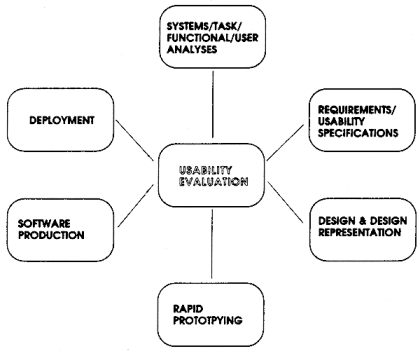
of development, shown at figure P, is called the star life cycle because of its shape.
In practice, any activity in the development cycle can be carried
out first and development of a system is not restricted to a rigorous
sequential process. The star method is thus "supportive of
both top-down and bottom-up development" and it can be noted
that it is "evaluation-centred" [Hix & Hartson 1993].
This allows iterative design to be accommodated since the designer
can work with any activity in the knowledge that the design process
will always pass through the centre point (usability & evaluation)
before he moves onto another one. Knowledge gleaned from evaluating
one aspect of the proposed system can thus be fed into the other
activities.
Figure P
Prototyping
One area of significant and obvious
difficulty in designing interactive systems is that "the
customer and the user may not have a clear idea of what the system
will look like when it is done". Shneiderman [1992] recognised
this problem in one of his "three pillars of design".
One way around the problem is to prototype the interface with
the user and revise designs with the feedback. Otherwise, as Shneiderman
[1992] points out, "it is difficult, costly and time consuming
to make major changes to systems once they have been implemented".
The great advantage of prototyping,
of course, is the ability to involve users in the decision making
process (they are experts in their tasks after all) at an early
stage. There are various levels of prototyping. Firstly there
is the throw-away, or rapid, prototype in which only the knowledge
gained from the testing of it, with the user, is kept. Concept
tests, as in The Interface could be
considered to be in this category. The tools for these, often,
"low fidelity" [Preece et al 1994] prototypes
tend to be relatively cheap and are used to produce proposed designs
quickly. High fidelity prototypes, on the other hand, can be used
to mimic the envisaged system complete with its functionality
and interface. These can be costly but will give the user a considerable
preview of what the final system will be like.
However extensive prototyping is
not free from disadvantages. As modelled by Boehm cited in Preece
et al [1994], an ever increasing spiral of prototypes may
create more problems (such as a lack of management control) and
thus be accompanied by spiralling costs. To avoid such costs Harrison
cited in Preece et al [1994] considers the introduction
of his "W" model of prototyping. In this model, the
system is prototyped only once and only on a small scale so that
"the system requirements are fixed and a traditional approach
to development is undertaken." Preece et al [1994].
As a consequence this "evolutionary" spiral of multiple
prototypes is regulated.
Conclusion
I introduced this chapter by taking
up the argument that user involvement during the development of
interactive systems would prove both effective and worthwhile.
However I have discovered that the usability approach to interface
design is not the sole cure-all to expedient design and
I have attempted to illustrate this during my discussion.
Indeed, Ives and Olson cited in
Shneiderman [1992] point out there are disadvantages of a participatory
methodology. They put forward that user involvement could be "costly
and lengthen the implementation period, build antagonism with
those not involved or whose suggestions have been rejected".
They continue by suggesting that it may "force designers
to compromise their design to satisfy incompetent participants
[or] simply build opposition to implementation" generally.
It seems that the initial idea of involving users may introduce
as many problems as it solves.
However there has been enough interest,
in the issue, for the ISO to produce a draft specific standard
(ISO 13407) for user centred design [NPL 1995b] reinforcing both
the credibility of, and the need from industry for a standard
guideline on, participatory design. I would therefore suggest
that the involvement of users to aid in the design of interactive
systems is here to stay.
|