Feedback
Introduction
Feedback Systems
Conclusion
Introduction

Feedback can be seen as a "fundamental
principle" [Cox & Walker 1993] in interactive systems.
Without it a user will have no idea what state the system is in
and whether his input has been actioned. According to Norman [1988]
feedback is defined as the "sending back to the user information
about what action has actually been done [and] what result has
been accomplished". The user in turn can then decide that
the task is complete or that further action is required.
I will, in this chapter, go into
more depth about how feedback is considered and demonstrate why
it is important to the overall design of interactive systems.
Future,
Present and Past Feedback
Barfield [1993] widens the concept
of "past feedback", as described by Norman, by adding
two more. Firstly "present feedback" which involves
informing a user of what is actually happening currently. For
example the Windows mouse pointer depicting an hour glass timer
which indicates that the computer is in a state of processing.
Secondly "future feedback", which she concedes could
be "called ..Feedforward", which may enable a user to
ascertain what would happen if a certain choice was made. For
example a Windows confirmation dialogue box allowing a second
chance to avoid deleting a file.
I would suggest, therefore, that
there is an obvious link between feedforward and guessability.
The more aware the user is made of the results of available choices,
the greater the chance of him choosing the intended course of
action. In effect the system becomes more guessable to the user.
Guessability is further discussed in chapter
5.
Barfield [1993] also isolates "..three
channels [of feedback]: sight (visual feedback), hearing (audio
feedback) and touch (tactile feedback)". The design of certain
systems do not necessarily rely on the one form of feedback but
may involve a "combined feedback" [Barfield 1993]. There
is a good example of this in The Valve Wheel.
Ensuring
Continuity
As well as knowing what has happened
to a system, it would seem wise to give a user some form of feedback
to 'link' each of the before and after states. In Barfield et
al [1993], she gives an example illustration of "iconising
a window ...[where]... the user sees the window suddenly disappear
and somewhere on the screen the corresponding icon appears".
Continuity in the form of a reducing animated wire frame around
the window down to the boundary of the icon may be used to enhance
feedback, giving the user notice of where his window has gone
to [Apple Computer Inc. 1986]. Barfield et al [1993], describes
the way "our visual perception... makes us more aware of
animated than static visual features"; she suggests that
it "makes sense to exploit this sensitivity to animation
when designing". There is, therefore, little excuse, with
today's powerful systems, not to include the simplest of animations
in their interfaces.
Feedback
Systems 
The
Sign and the Use of Colour
Not all interactive systems need
to be complicated. A sign is an example of an interactive system
that needs no input by the user, viewer in this case, to obtain
output. Although not an interactive system in the true sense of
the word, the humble sign can give feedback simply, quickly and
can pass on the message with ease. In the same manner it can also
give an ambiguous and possibly conflicting instruction or piece
of advice if it has been poorly designed. However what constitutes
good sign design?
The design of a usable system is
dependant on various criteria. As Preece et al [1993] state:
"Designing usable systems requires knowledge about: who will
use the system [and] what it will be used for...". Using
these items as the test criteria for a good sign design consider
the examples at figures A and B. It can be assumed
that both signs are for use by the general public (the users)
and are to convey an instruction and some advice respectively
(the tasks). This assumption can be clarified as follows:
The advantage of using graphical
representation on the signs rather than words, is that the message
given can be received by a wider audience. For instance a sign
stating 'No Smoking' will not be understood by those who cannot
read or people who cannot read English. Therefore, at an international
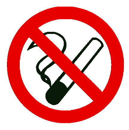
airport for example, use of the sign shown at figure A (a cigarette
with a line though it) will give a clearer message to more people
thus increasing usability and the effectiveness of the sign.
The use of colour in signs will
also have an effect. The assumption that figure
A is a sign giving an instruction and that the sign shown
at figure B is an advice sign can be confirmed
by their colour. The red/green, stop/go scenario can be seen throughout
society (Traffic lights are an obvious example). Designers not
only use this aspect to aid their designs but are indeed expected
to use it to reinforce users' preconceived ideas.
Figure A
Figure B
Crisp packets are another example
where a specific colour is expected for a specific flavour. Similarly,
mint sweets are usually packaged in green or blue and never in
red. Expectation can therefore determine the colour of something
which in turn can, in itself, be used as an aid to identify its
meaning or purpose. Mayhew [1992] confirms that "colour associations
can be exploited in computer user interfaces".
Preece et al [1993] continue
with the next point to take into account when designing a usable
system: "...the work context and environment in which it
will be used...". Using this item as the test criteria for
a good sign design consider the examples at figures
C and D
These signs, take into account the
nature of the environment in which they are to be used, i.e. a
burning building because both signs are fluorescent which therefore
increases the chances of being viewed in a smoke filled room.
However only figure D conforms to the
EEC council directive for emergency escape designs 92/58/EEC 24/6/92
[Colin Davis 1993] again demonstrating the importance of the universal
nature of the graphical interface.
Figure D
This section has only outlined some
guidelines as to what makes an effective sign design based on
who the user is and the way he expects to be informed. However
the lessons learned in the design of simple signs can be easily
transferred to larger projects.
The
Valve Wheel
Another interesting interactive
system that can demonstrate effective feedback, and yet is based
on the simplest of design ideas, was discovered on my recent visit
to U-boat 534. The submarine is based in a museum in Birkenhead,
on the Mersey river, and is open to the public. The scenario involves
the design of the 4 wheels which control the ballast valves, whose
task is to raise or lower the submarine.
The valve wheels have been specifically
tailored to take into account a total blackout during a voyage,
perhaps as a result of loss of battery power. If the submarine
had suffered a depth charge attack, which had possibly caused
the blackout in the first instance, any error in the use of the
valves may result in fatalities since the submarine may unintentionally
manoeuvre to the incorrect depth and be damaged. Therefore the
valve operator must be able to instantly know which valve to turn
in complete darkness.
There are 3 ingenious design features
that offer feedback to the operator to help in this task during
a blackout:
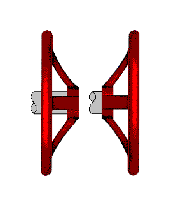
- There are two wheels that raise
the submarine and two to lower it. One set of wheels has been
reversed onto the screw valves, not by mistake as noticed
by a casual observer but intentionally, so that the operator
will know which set is which, by the sense of touch. See Figure
E
- The number of spokes on each
valve wheel varies too, again to give an indication of which
wheel is being felt.
- The final, simplest and most
effective indicator uses the sense of sound. Each wheel has
been cast using a different amount of metal and when struck
with a metal implement, such as a spanner, will ring with
a differing tone to the other three.
This example demonstrates three
channels of feedback in the one system.
Figure E
The
Video Recorder
Even if Bill Gates's original vision
of the PC being "on every desk and in every home" is
not now a realistic one [Gates 1996] there is no doubt that the
majority of homes in the western world over the last 20-30 years
have still been invaded by IT. Despite the blandness of the record/watch
later concept, the VCR contains a significant amount of computing
technology.
Considering that VCRs, and other
items of domestic technology, are used by the whole range of the
population, there has been much criticism on the poor levels of
usability of these items. As considered by Nuttall [1995] "Complicated
gadgets bristling with buttons are making our lives more difficult
when they should be getting easier".
Even just concentrating upon the
humble VCR there is a litany of complaints. One example is the
reset or time out mode which resets the machine if the owner pauses
while programming it. As Thimbleby cited in Nuttall [1995] details
"If you have to stop to look
at the instruction manual, which you nearly always have to do,
the thing wipes out what you've already done. It's infuriating,
and quite unnecessary".
He continues with another example
of poor feedback concerning the on/off light of some VCRs which
stays on for a moment after the recorder is switched off:
"If I worry that maybe I
haven't really switched the thing off and I press the button
again, the recorder enters 'child lock mode' which really messes
things up. Such problems are all entirely typical, all entirely
avoidable" [Thimbleby in Nuttall 1995].
Interestingly, I have a similar
problem on the Compaq PC at my office; I have tended to switch
the monitor off but the green light indicator, on the switch itself,
takes a few moments to 'cool' off. I therefore tend to re-switch
it on again before I realise I have indeed switched it off in
the first place. I am aware of it now but when the PC was new
I would often leave the monitor powered on all night without realising.
There have been efforts to try and
avoid the acknowledged problems of usability in video design.
One design, Video Plus, which is licensed by Gemstar Development
Corporation and used as a standard by most video manufacturers
including the Sony Corporation [1993], attempts to simplify one
of the biggest areas of upset, programming. Instead of the video
operator having to input start and finish times, date and channel
of the required program, a numeric code (PlusCode) of up to 8
digits is used. These codes are displayed next to their relevant
programs as listed in newspapers and other publications and can
be typed into a remote commander (hand-set) ready for transmission
to the VCR itself.
The system works well, is simple
to operate and also has a preview facility, on the remote commander,
to check the program details before final transmission to the
VCR, although there is a necessity to purchase the codes (e.g.
a paper) for the system to function.
Reducing Stressful Feedback
Not all feedback is welcome. I suggest
that the feedback giving advanced warning, as described by Barfield
in Future, Present and Past Feedback as feedforward, could
be prone to adding stress to an experienced user of a system.
I return you back to the Windows file manager delete confirmation
dialogue box, noted in Future, Present and Past Feedback, which gives a good example of an interaction
event which could cause annoyance to a user (interaction is discussed
in Interaction). Experienced users of the
windows file manager would become quite frustrated if every command
was re-questioned. One way in which annoying feedback can be reduced
is to put the user in control of the system he is operating.
The Microsoft Corporation assumes
that stressful feedback will exist, for some users, in their Windows
system (the user base is massive after all) and have designed
it to be user controlled via customisation. As the Microsoft Corporation
[1993a] point out
"If you do not want a confirmation
message to appear each time you delete or replace files and
directories, you can change the confirmation settings".
Software applications such as Quicken,
a home accounts package, include future feedback in the form of
prompt boxes/cards. These Qcards, as they are known, pop up automatically
on screen to "help you enter the correct information"
[Quicken 1994]. The advantage of this system is that the user
has an option to turn off just those cards he wants to, thereby
aiding where it is needed and not where it isn't. Eventually,
as the user becomes progressively familiar with the package, the
need to activate these cards will lessen. Their prime aim is to
train the user, of course, but they have the ability to do this
without placing stress on developing or experienced users.
Conclusion
Feedback can be compared to light
in photography. Without light a photograph will be blank; however
when light is added other factors become apparent to play their
part in the whole creation of the photograph. Similarly feedback
not only throws light onto the state of a system but highlights,
and in turn is affected by, other factors which affect overall
usability such as the user's interpretation and perception of
it.
I have, in this chapter, demonstrated
why feedback is fundamental in the development and design of interactive
systems. Feedback can be considered to be the communication between
the system and the user without which he will have no way of knowing
what has occurred, what is occurring and what will occur if a
certain action is taken.
|