Guessability
Introduction
MAQUIS
The Windows GUI
Conclusion
Introduction

In chapter
3 I stated that guessability was a measurement. Moyes and
Jordan [1993] defines guessability as being "..the measure
of the cost to the user involved in using an interface to perform
a new task for the first time". She notes cost "in terms
of time, errors, or effort". Jordan et al [1991] would
conclude that "the less time and effort required [the cost]
the higher the guessability"
The amount of time and effort taken,
however, may not actually occur all at once for all situations.
Consider the following case:
A door knob, for example, will enable
the opening of a door where as a finger plate and handle will
indicate which way the door actually moves too. Consequently the
amount of thought (mental effort) required and the time needed
to come to a decision, as to which way the door opens, is therefore
reduced. It could be demonstrated therefore that the system of
finger plate/handle is more guessable.
However it could be argued the main
factor that makes this solution guessable is that the user is
already aware of it. The time taken in guessing the system has
therefore not actually been reduced, but spread out, since this
learning time has been taken up in the past. As a result the system
only seems to be more guessable.
Either way consideration must be
given when a system is designed to make it more guessable, thereby
reducing the time and the effort needed to use it. By using the
preconceived ideas of users and understanding their perception
of other systems, a designer would be able to use this expectancy
to increase the guessability of a system. This will ultimately
accomplish a greater usability. User perception is a large topic
in its own right and is further discussed in User Perception.
MAQUIS

Introduction
MAQUIS is the Mines And QUarries
Information System and is accessed via a soft function
key interface. It is used by HM Inspectorate of Mines, a division
of the Health and Safety Executive. MAQUIS is now over 11 years
old and was developed at a time when usability was only just becoming
an issue for the IT industry. The system is due to be replaced
in the near future. However I have included it in this dissertation
because it gives both good and bad examples of guessability.
High
Guessability Interface
Among the numerous advantages of
such an interface, as described by Mayhew [1992], the system of
using on screen keys is, "self-explanatory... easy to use
...[and]... requires little human memory...". As a consequence
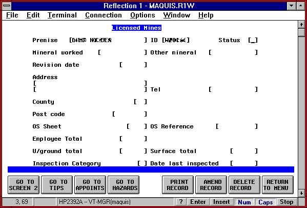
the guessability of this dialogue style is high. Indeed figure F clearly demonstrates that the on screen keys will
give the user a clear indication of what action can be taken by
the mere click of a button. Unfortunately there is no mention
of which button on the screen relates to which function key on
the keyboard.
Figure F
There is also a fail-safe return
to menu button allowing, in effect, an undo to be made if this
screen had been selected incorrectly. Mayhew [1992] points out
that "users may adopt a trial and error approach" if
error recovery is "not costly". MAQUIS on this screen,
at least, serves the users well in this respect.
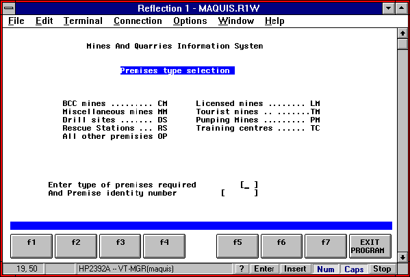
Low
Guessability Interface
Consider the same system but at
a different menu location shown at figure G.
Conversely guessability at this point in the program is quite
poor. The user, this time, is given no clue; after following the
screen instruction what does he do to further the enquiry?; there
is no message to help. Here the screen keys do have keyboard identifiers
but their actions are not labelled (I know by experience that
they don't function at this point in the program anyway). Also
what does 'exit program' mean? It in fact returns the user to
the main menu if selected as opposed to ending the whole session
but why could it not state 'return to menu' as in figure F thereby keeping the whole system consistent?
Figure G
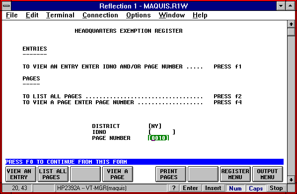
Now consider the subsequent screen
to be encountered by the user (Figure H).
The user is told to Press F0 to continue but there is no F0 on
the keyboard. Also the reference to 'form' will make no sense
to a user. The form is programming parlance for an individual
screen but how would the user know this. Also the user may be
confused by the unlabelled screen keys. What are they for? Contrast
this with the previous screen that displayed keyboard identifiers.
Inconsistency can be confusing to a user who is trying to guess
the system logically.
Figure H
Conclusion
Similar inconsistencies of guessability
can be found throughout MAQUIS. However the current operators
of the system are experienced users and so guessability is not
a concern. Guessability would only be an important factor in a
system that is unfamiliar to the user. Once a system is learnt,
a user does not need to guess its operation and as already discussed
in Reducing Stressful Feedback
on screen feedforward aiding guessability may actually have a
detrimental and stressful effect for experienced users anyway.
The
Windows GUI
Introduction
I couldn't justify writing a dissertation
that evaluates usability without mentioning, in more detail than
in Future, Present and Past Feedback & Reducing Stressful Feedback , the Windows interface when considering
the tremendous effect PC's, using windows, have had on the world.
When taking into account the amount of users worldwide I couldn't
envisage a wider test area for software. I suggest that for a
software to sell so well it must have its fair share of satisfied
users; marketing hype would not have stretched over so wide an
area or length of time. This makes Windows an ideal subject for
review because there must be some good points in usability design
which can be considered. What better interface is there for such
a review?
Windows'
Menus
I have concentrated my research
into Windows on its menu system. It gives an excellent example
that can demonstrate how usability is enhanced. This is achieved
for two main reasons. Firstly the effectiveness of the system's
learnability is enhanced because it exists throughout the software
applications and packages that use the Windows GUI. It, in effect,
becomes the standard way for a user to select options in various
packages . Once the user is able to operate the selection method,
he may transfer his skill to any other Windows based product without
the need for more training. Secondly the guessability of selection
is increased in the way the menus are constructed and defined
as detailed in Standard
Window Menu Option Indicators.
Menus
Generally
As the name suggests a menu lists
options for selection. The first improvement that can be noted
from this method is that the user is presented with a choice to
choose from rather than a command line system, for example, in
which he has to remember the command words. According to Mayhew
[1992]
"menus rely on recognition...
rather than recall memory ...Recognition memory is faster and
more accurate... and menus exploit this fact".
Menu options are self explanatory
and thus cognitive workload is reduced allowing the user to concentrate
on the task rather than how to battle with the system.
Also Mayhew [1992] suggest that
a menu system "requires fewer keystrokes than other dialogue
styles". She continues, stating that a menu gives "less
opportunity for user error" and when errors are made, there
is only "a limited set of valid inputs" enabling easier
error handling.
Unfortunately there are disadvantages
to menus too. Menus are only effective in small simple structures.
A complicated series of menu selections may become tiresome especially
if the task is a commonly used one. In this case a command line
method may be more effective and less "tedious" [Mayhew
1992]. Mayhew [1992] also suggest that menus are "impractical
for numerous choices" and that they are "inflexible
...[and]... is system rather than user controlled". However,
as usability awareness evolves, some applications such as AmiPro
now allows users to customise their own menus [Lotus 1996].
Standard
Window Menu Option Indicators
The way in which menus are designed
can have a significant effect on the guessability of option selection.
There is a standard set of menu indicators which most Windows
compatible products adhere to. These have been designed to overcome
specific problem areas.
One problem, initially discussed
in Technophobes Born of Marketing Constraints , is that people tend to
be generally weary of new technology. For example there is a real
fear that if they press the wrong button on a PC it may well become
damaged in some way. Norman [1988] highlighted this too by proposing
that "people have a tendency to blame themselves for difficulties
with technology". Assuming that generally usability is not
perfect, every user will have a problem with IT at some stage
which will result, for some, in almost fear when they interact
again with IT. A self perpetuating circle of blame, fear and confusion
is thus created.
One aim of a menu system, therefore,
should be to make the interaction as unfrightening as possible
for the user and to break this cycle of self blame. If a user
knows what is going to happen if he makes a certain choice, as
opposed to even the unrealistic chance of a damaged PC, he is
more likely to try it out, guess it in other words. The self induced
sanction against trying out a system is wiped away encouraging
the user to try other options that he would not have ventured
into otherwise.
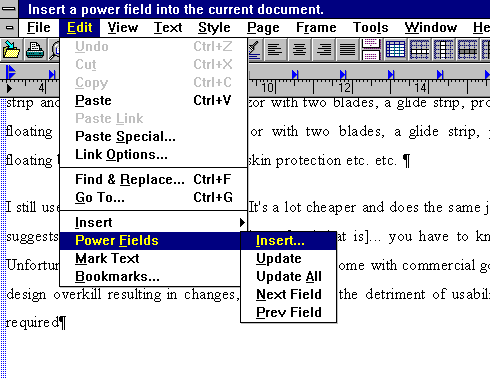
Figure I
I will now discus the menu indicators
using the sample view of an AmiPro screen shown at figure
I. The menu bar shown near the top of the screen gives the
title of each menu option, from which "drop-down (sometimes
called pull-down) menus" [Feldman et al 1993] are
spawned. This edit menu tends to be common to many packages, again
improving learnability and guessability. Consider figure
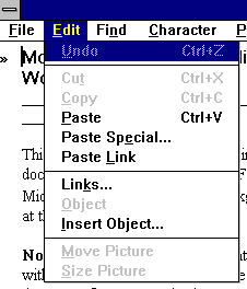
J which gives a screen view of Write (the Windows word processor).
If a user hadn't used Write before, but had used AmiPro he would
be able to guess, and correctly so, that the edit menu will contain
the 'paste' option.
Figure J
Returning to the AmiPro screen,
you can see that some options have a triangle (>) associated
with them. This indicates to the user that the selection of this
menu option will "invoke cascading menus" [Feldman et
al 1993]. In the example, figure I,
selection of 'Power Fields' will cascade another menu giving options
associated with power fields.
An ellipsis (...) following a command
is used to indicate that "a dialogue box appears when you
choose the command" [The Microsoft Corporation 1993b]. A
user is safe in the knowledge that if he guesses an option, and
it's the wrong one, he can exit from the dialogue box before any
action is processed by the computer. This ability to 'try before
you buy' encourages users to explore the menu structure without
fear of changing the current situation of the task being undertaken.
Some of the menu options in the
example are "dimmed" [The Microsoft Corporation 1993b]
or greyed out, which is the more common term used. These options
are "unselectable" according to Mayhew [1992] and are
displayed in grey indicating that they are "currently inactive...
due to temporary and minor changes in the system state".
In other words options not relevant to the current state of the
task being undertaken cannot be chosen. Greying out thus removes
the need for error handling for incorrect choices.
For instance, in the sample AmiPro
screen view figure I, the 'cut' command is greyed out because no text
has been highlighted for cutting. There would be no point in allowing
the option to be taken only to display a message stating that
the command was not relevant anyway. In turn this would also begin
to annoy the user.
Mayhew [1992] considers the alternative
of deleting the currently inactive menu item from the menu itself
so that only the relevant items are displayed. This would initially
seem the best solution however she concludes that "since
menus as a dialogue style are intended for the novice ...user...
it would seem sensible to choose greying out". I would suggest
that too many changes to the structure may prove to be counterproductive
in terms of guessability.
Other guides or indicators adding
to the users' knowledge of what is happening within the system
includes; check marks to indicate that a specific option has been
chosen, e.g. that highlighted text has been emboldened (which
is not always obvious from simply viewing the screen) and "separator
bars that break up long menus" [Feldman et al 1993]
helping in grouping associated selections, which in turn aid guessability.
Conclusion
Even in this small area of review
I have demonstrated that Windows guessability is high in comparison
to a command language for instance, which relies upon remembering
specific commands. Avoiding cognitive overload is therefore one
essential if a system is to be offered as guessable. Introducing
the option of an undo method, if a user is brave enough to find
his own way through a system, is another way of improving guessability
mainly because it will build up the confidence of the user, which
in turn will aid in keeping a user's "stress low and satisfaction
[with the system] high" [Mayhew 1992].
Conclusion
In this chapter I have detailed
good and bad examples of design in terms of a system's guessability.
I have demonstrated that increasing the guessability of a system
can be done inexpensively by introducing subtle enhancements to
menus, buttons and messages or by using existing methods that
have already been mastered and can be easily transferred across
systems.
The role of guessability plays a
vast part in the overall usability of a system and I have given
only a few specific examples to help discuss elements of it. Effective
mapping has a great effect on the usability of a system in terms
of its guessability and this is further discussed in the next
chapter.
|